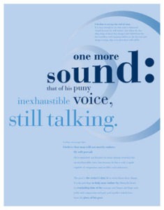
Typography is the art and technique of arranging type to make written language legible, readable, and appealing when displayed. The arrangement of type involves selecting typefaces, point size, line length, line-spacing (leading), letter-spacing (tracking), and adjusting the space within letter pairs (kerning).
Typography is, quite simply, the art and technique of arranging type. It’s central to the work and skills of a designer and is about much more than making the words legible. Your choice of typeface and how you make it work with your layout, grid, color scheme, design theme and so on will make the difference between a good, bad, and great design. You can learn the basics from any tutorial, but good typography is often down to creative intuition.
1. Font
There’s an astonishing array of free and for-purchase fonts to choose from online. But with great power comes great responsibility. Just because you can choose from a vast library doesn’t mean you have to; there’s something to be said for painting with a limited palette and tried and tested fonts like Helvetica continue to serve us well.
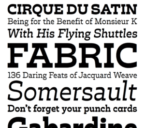
A typeface, like any form of design, is created by craftsmen over a substantial time, using the talent and experience they’ve been honing for many years. The benefits of a professionally designed font – various weights and styles to form a complete family, carefully considered kerning pairs, multi-language support with international characters, expressive alternate glyphs to add character and variety to type-setting – are not always found in a font available for free.
Here are some of the most important typographic considerations that professional designers need to take into account.
2. Size
All typefaces are not created equally. Some are fat and wide; some are thin and narrow. So words set in different typefaces can take up a very different amount of space on the page.
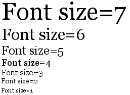
The most common method used to measure type is the point system, which dates back to the eighteenth century. One point is 1/72 inch. 12 points make one pica, a unit used to measure column widths. Type sizes can also be measured in inches, millimeters, or pixels.
3. Leading
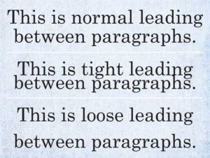
Leading describes the vertical space between each line of type. It’s called this because strips of lead were originally used to separate lines of type in the days of metal typesetting. For legible body text that’s comfortable to read, a general rule is that your leading value should be greater than the font size; anywhere from 1.25 to 1.5 times.
4. Tracking and kerning
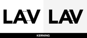
Kerning describes the act of adjusting the space between characters to create a harmonious pairing. For example, where an uppercase ‘A’ meets an uppercase ‘V’, their diagonal strokes are usually kerned so that the top left of the ‘V’ sits above the bottom right of the ‘A’.
Kerning is similar to, but not the same as, ‘tracking’; this relates to the spacing of all characters and is applied evenly.
![]()
5. Measure
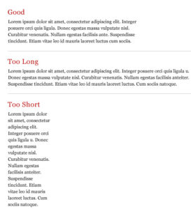
Measure describes the width of a text block. If you’re seeking to achieve the optimum reading experience, it’s an important consideration.
6. Hierarchy and scale
If all type was the same size, then it would be difficult to know which was the most important information on the page. To guide the reader, then, headings are usually large, sub-headings are smaller, and body type is smaller still.
Size is not the only way to define hierarchy – it can also be achieved with color, s p a c i n g, and weight.

